Projekter
This site is itself an artwork. Three language models — Claude (Anthropic), ChatGPT (OpenAI) and Gemini (Google) — analyse Lars Bruun's paintings. Lars Bruun responds. The analyses are published without editing.
The protocol: Each painting was uploaded to three language models with the same prompt. The models were asked to distinguish between observation, formal analysis and interpretation, and to pose questions to the artist.
Transparency: Which models were used and when is stated in each analysis.
Lars Bruun's position: He reads, comments — and reserves the right to declare any analysis wrong.
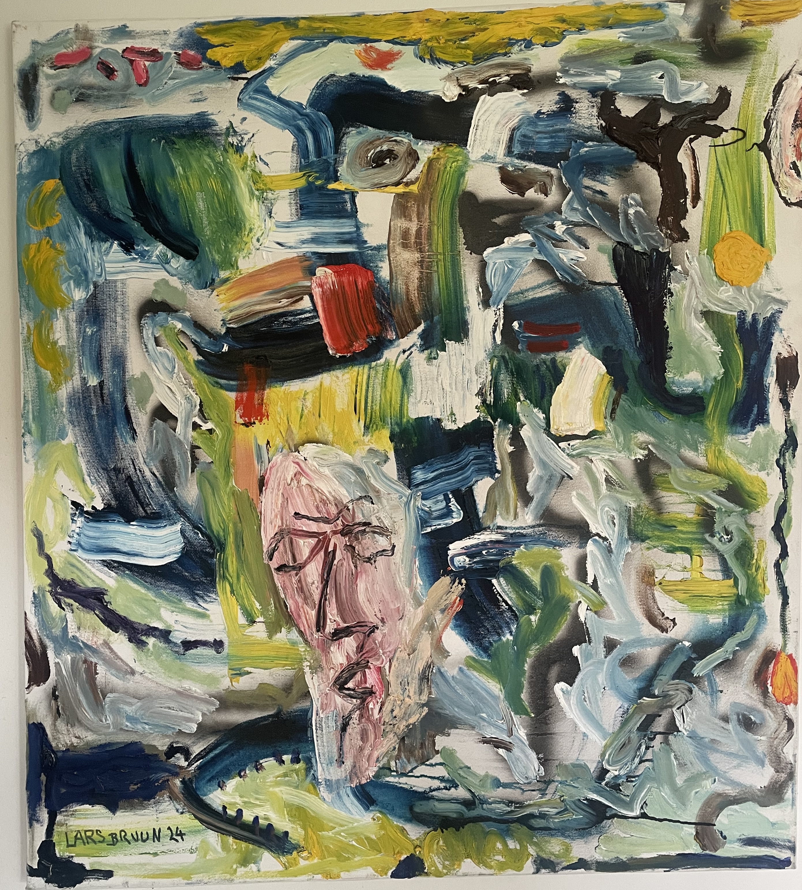
Face in Green · 2024
Face in Green
The painting shows an abstract work in portrait format with thick, impasto paint. In the lower centre, a pale pink form with calligraphic marks appears — a face in profile with closed eyes. Formally, the composition is all-over: no clear figure-ground relation, but a woven field of strokes where the red area and the pink face-form serve as optical anchors. The brushwork is rapid and multidirectional, with murky wet-in-wet blending.
Interpretively, the painting can be read as a head- or body-landscape, the closed-eyed pink face becoming a sleeping or inward-looking subject surrounded by a chaotic, vegetative field of colour. The tension between organic greens and aggressive reds and blacks suggests an inner restlessness behind a closed exterior. Art-historically, the work resonates with the CoBrA tradition — Asger Jorn's spontaneous, mask-like figurations — and with de Kooning's way of letting the figure emerge and dissolve in gestural strokes.
The central ambiguity: is the face intentional, or pareidolia? This oscillation between abstraction and figuration is the painting's strongest effect.
Questions for the artist: Is the pink face-like form conscious figuration or did it emerge during the process? Do you work from a motif or purely from colour and gesture? Do you see a connection to the CoBrA tradition?
The painting is built as a dense, almost entirely filled pictorial field. In the lower centre, an elongated pink face-form appears with suggested eyes, nose and mouth, cut through and partly covered by blue-green, white, black, yellow and red strokes. The composition lacks a clear perspectival space — depth arises through overlap. Warm red and yellow accents interrupt the cool dominant palette, creating brief visual shocks.
It is an interpretation that the face can be experienced as a human presence struggling to emerge from a chaotic environment. The surroundings can be read as city, machine, landscape or mental state — none stabilised. The face's features are clear enough for the viewer to seek a person, yet dissolved enough for identity to slide back into the paint. The work may concern the very struggle between recognition and dissolution.
The raw brushwork and spontaneous semi-figurative forms recall CoBrA's interest in direct, non-academic signs — Cobra, de Kooning, post-war abstraction.
Questions for the artist: Did the face appear early or late in the process? What led you to keep the strongly red areas? Is it important that the viewer can still see a face?
The painting is a dense, colour-saturated field of abstract and semi-abstract forms. In the lower centre, the contours of a human face emerge — painted in a pale red tone, with black marks for closed eyes, nose and mouth. Around it swirl vigorous strokes of blue, green, yellow and black. Red colour-patches appear at the top. Signature 'LARS BRUUN 24' lower left.
The composition fills edge-to-edge without a clear central perspective except for the face. The palette is primarily cool with strong blues and greens, broken by warm yellow and red points — dynamic colour contrast. The surface shows impasto: thick layers giving pronounced materiality.
The turbulent, swirling colours can be interpreted as an outer world in chaos or inner tumultuous feelings. The closed-eyed face appears as a calm, meditative anchor in the storm. A duality: the human's inner withdrawal from a chaotic reality. Strong links to neo-expressionism and the CoBrA movement, especially Asger Jorn.
Surprising: The contrast between the wild, explosive surroundings and the face's total passivity. One expects a contorted face in such chaos — instead finding calm or apathy.
Response not yet available.
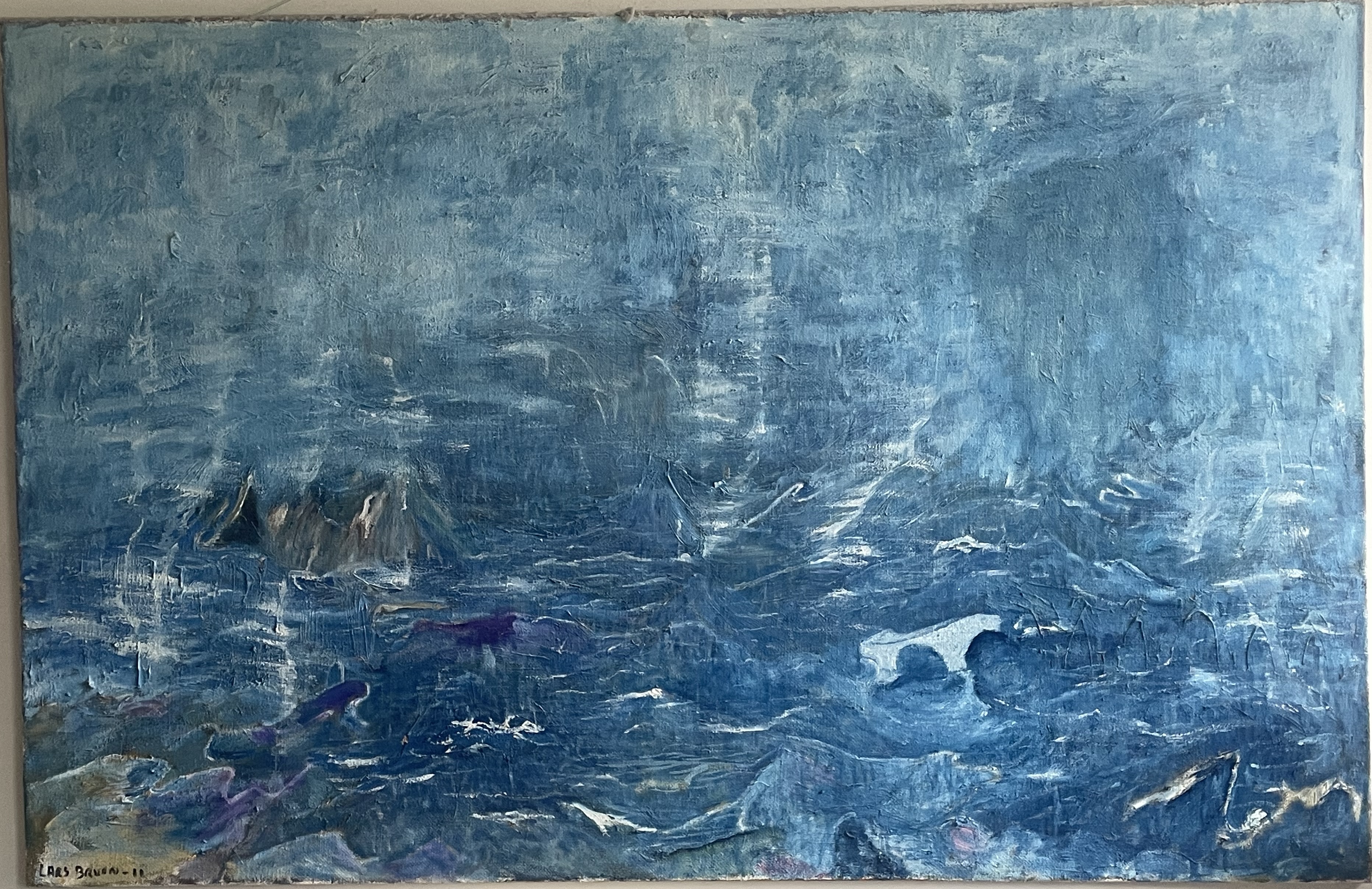
Blue Sea in Mist · 2011
Blue Sea in Mist
A monochrome blue painting in landscape format. The entire surface is held in layers of lighter and darker blue with white scrapings; in the left mid-field a dark angular form — rocks or skerries — and in the lower half suggested wave movements. The surface is textured with impasto accumulations and scraped passages. Signed 'LARS BRUUN -11'.
Formally, the painting is built on tonal differences within one colour. The composition is almost atmospheric: a diffuse upper zone flows into a more agitated lower one. The dark rock form, as the only stable anchor, breaks the otherwise dissolved surface, creating a spatial reading — a sea in mist.
Interpretively: a mood-landscape about solitude and dissolution — the fixed (the cliff) about to disappear into the formless (fog, sea). Resonances with J.M.W. Turner's late, almost motif-less seascapes and Per Kirkeby's insistence on painting as 'sediment'.
The surprise: How figurative the painting seems at a distance, how abstract close up — waves dissolve into pure scrapings and deposits.
The painting has a wide horizontal format, almost entirely in blue, blue-grey, white and scattered brownish-violet tones. The upper part appears as a dense, turbulent atmospheric field, while the lower part is characterised by more undulating horizontal strokes. Around the centre: low brownish-grey forms on the left, a lighter form on the right.
The composition is organised in broad horizontal movements broken by scraped and diagonal strokes. The limited palette makes small differences in tone and brush direction particularly significant. Depth arises not through sharp perspective drawing but through gradual shift from darker layers to more misty ones.
The painting can be experienced as a cold sea, a flooded landscape or a coast in dim light. The many horizontal movements create a sense of continuous flow; the absence of a stable horizon lets sky and sea merge. Relevant connection to the maritime painting tradition and to abstract expressionism.
The ambiguity: The relationship between openness and enclosure — you can see far, but cannot see clearly.
The painting has a wide horizontal format dominated by blue, blue-grey and whitish tones. Upper part: light blue, whitish, cold and airy with only one small yellow-green dot centrally. Lower part: dark blue, almost black, strong broad strokes. A clear horizontal division almost edge to edge. The surface is crucial: paint applied thickly with palette knife or spatula marks.
A classic seascape. The division is an unmistakable horizon. Light sky against deep sea points to stillness. The small yellow dot takes the form of a celestial body (moon, sun) or distant ship. Gustave Courbet, Rothko, Danish colourist tradition. Material contradiction: we are presented with water and air (fluid, weightless) conveyed through heavily material impasto that shouts of physical resistance.
Response not yet available.
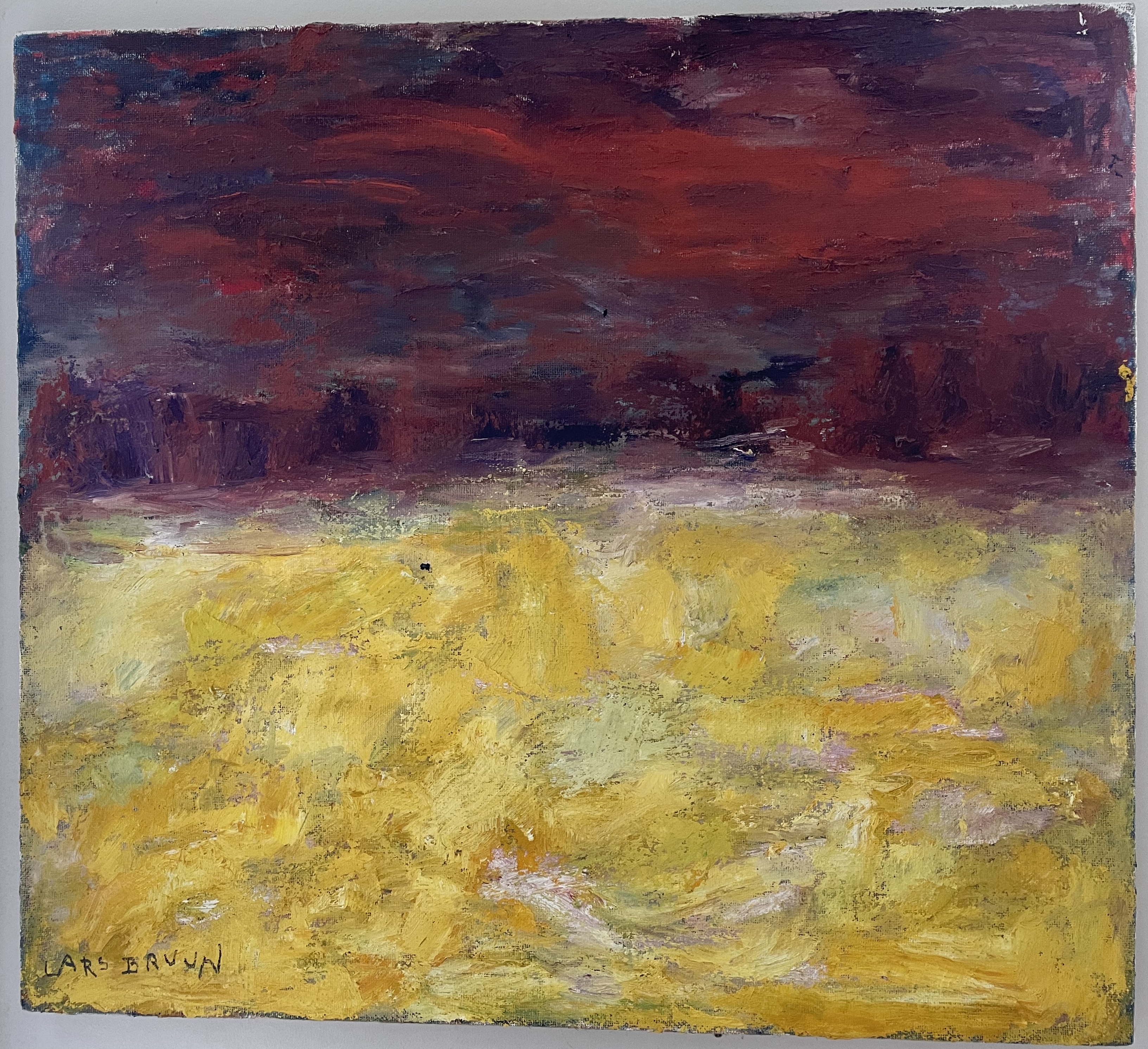
Field and Sky
Field and Sky
A landscape motif on a small board. Lower two-thirds: a yellow field in dry, circular strokes with green, white and violet. Upper third: a dark sky in deep red-violets and blue-blacks. On the horizon dark silhouettes — trees or bushes. The surface shows holes and grit; edges are worn.
Formally, the composition is classically two-part with a low horizon counterweight: the light, almost self-luminous yellow field pressing up against an unusually heavy, dark sky. The contrast is both tonal (light/dark) and temperature-based (warm yellow against cool red-violets). Brushwork in the field is short and rubbing.
Interpretively, the painting opens onto a double mood: the yellow as rape-field — life-force — the blood-red, darkened sky as ominous. A painting about waiting before a storm, or light holding out. Resonances with Emil Nolde (glowing fields, threatening skies) and the Danish modernist landscape tradition.
The ambiguity: Sunset or storm? Ending or threat? The painting refuses to decide.
The image consists of two striking horizontal zones. Upper (approx. one third): deep reds, purples and dark browns. Lower: yellow, ochre and light green tones in thick, swirling layers. No clear figures. The composition is classically two-part — inevitably suggesting a landscape. The surface is strongly impasto; light and shadow are created by the canvas's physical relief.
The work reads as an abstracted landscape: a field of ripe grain under a heavy, blood-red evening sky. The mood balances between idyllic and apocalyptic — a psychological landscape with the sky as threat from above. Mark Rothko ('Color Field') as a reference for the horizontal division and the emotional weight of colour, but with more gestural energy. Emil Nolde's marsh landscapes.
Surprising: The distribution of visual weight — normally the sky is given lightness and the earth heaviness. Here it is reversed: the dark red upper area feels massive and oppressive, while the yellow almost dissolves into luminous energy.
The image is divided into two solid colour blocks. Upper: a rust-orange horizontal field rolling down in a rough cut. Lower: forest green and yellow. Brushstrokes very visible: broad horizontal bands at top, turbulent diagonal and vertical bands below. Scale complexity: the two broad fields can be experienced as enormous geological zones while the surface maintains the closeness to hand and brush.
Extreme simplification reduced to two actors: the orange and the green block. The boundary between them unclear and jagged. Materiality prominent — impasto. The orange appears to press down over the green, creating claustrophobic pressure. Post-painterly abstraction, Nicolas de Staël's late, rough palette-knife landscapes.
Most ambiguous: The paper tab with '7' pulls the work out of its abstract space into something archival — the canvas takes on the character of object rather than 'window'.
Response not yet available.
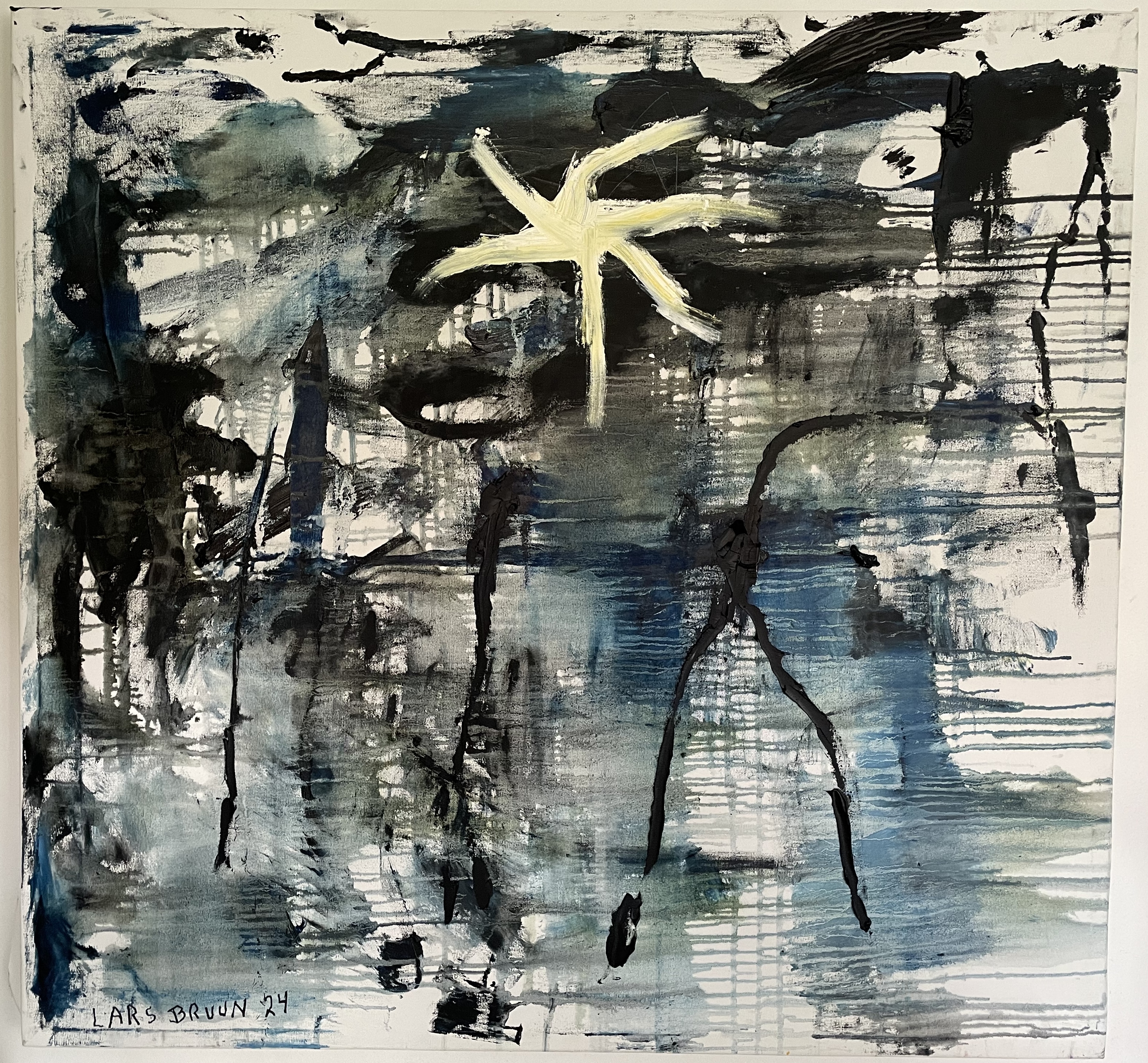
Star and Net · 2024
Star and Net
A large, nearly square abstract painting on white ground. Dominated by black and blue-grey areas — thin descending glazes and fat impasto black strokes — over a system of horizontal ruled imprints (grid structures or staff lines). Near the top centre, a pale yellow star-shaped figure as the only clear colour accent. Two long dark vertical forms hang down through the right half.
Formally, the painting lives on the contrast between control and decay. Glazes create depth like a rain-wet window; the fat black strokes lie demonstratively on the surface. Gravity is a visible collaborator — paint has clearly run vertically. The near-grisaille palette makes the star a compositional force centre.
Interpretively: a nocturne — a dark, dissolved world, the star as a sign of hope or ironic quotation. The deliberate naivety of the CoBrA legacy, resonances with Cy Twombly and Antoni Tàpies. Most surprising: the star's vulnerability — painted thin and pale yellow, not triumphant.
A near-square canvas dominated by blues, blacks, whites and greys. Near the top centre, an asymmetric star-like form in yellow-white. The rest covered in dark smeared areas and vertical black lines or runs. Some marks form slender grid structures. The star-form has the strongest light contrast and most coherent outline. The rest: fragmented and palimpsest-like.
The yellow form as lighthouse, star or cosmic element above a dark grid-like cityscape or mental prison. The runs and vertical marks create a sense of rain, melancholy, dissolution. Joan Miró's isolated celestial bodies. The automatism of abstract expressionism.
The contradiction: The star's asymmetric, almost clumsy formation — on one hand a symbol of the elevated, yet formally a vulnerable, fragile figure, almost like a child-drawn sticker placed on a bleak adult painting.
The image is dominated by black, grey, blue-green and white. The surface is criss-crossed by broad dark strokes, thinner lines, scraped areas, drips and grid-like patterns. Near the upper centre, a pale yellow-white star- or flower-like form with long arms. On the right, a rectangular black area and horizontal and vertical lines suggesting scaffolding or a ladder.
The star-form serves as the painting's clearest focus: greatest light contrast and most coherent outline. The rest of the composition is fragmented and palimpsest-like: layers painted over, scraped free and partly re-activated. The space is shallow and pictorial with glimpses of depth as through openings in a wall.
The most contradictory aspect: the meeting between the simple sign and the complicated surface. The star-form seems immediately easy to read, but its meaning becomes more uncertain the longer you look. Conversely, the surrounding dark structure first seems chaotic, but gradually reveals rhythms and possible spaces.
Response not yet available.
Orange and Green
Orange and Green
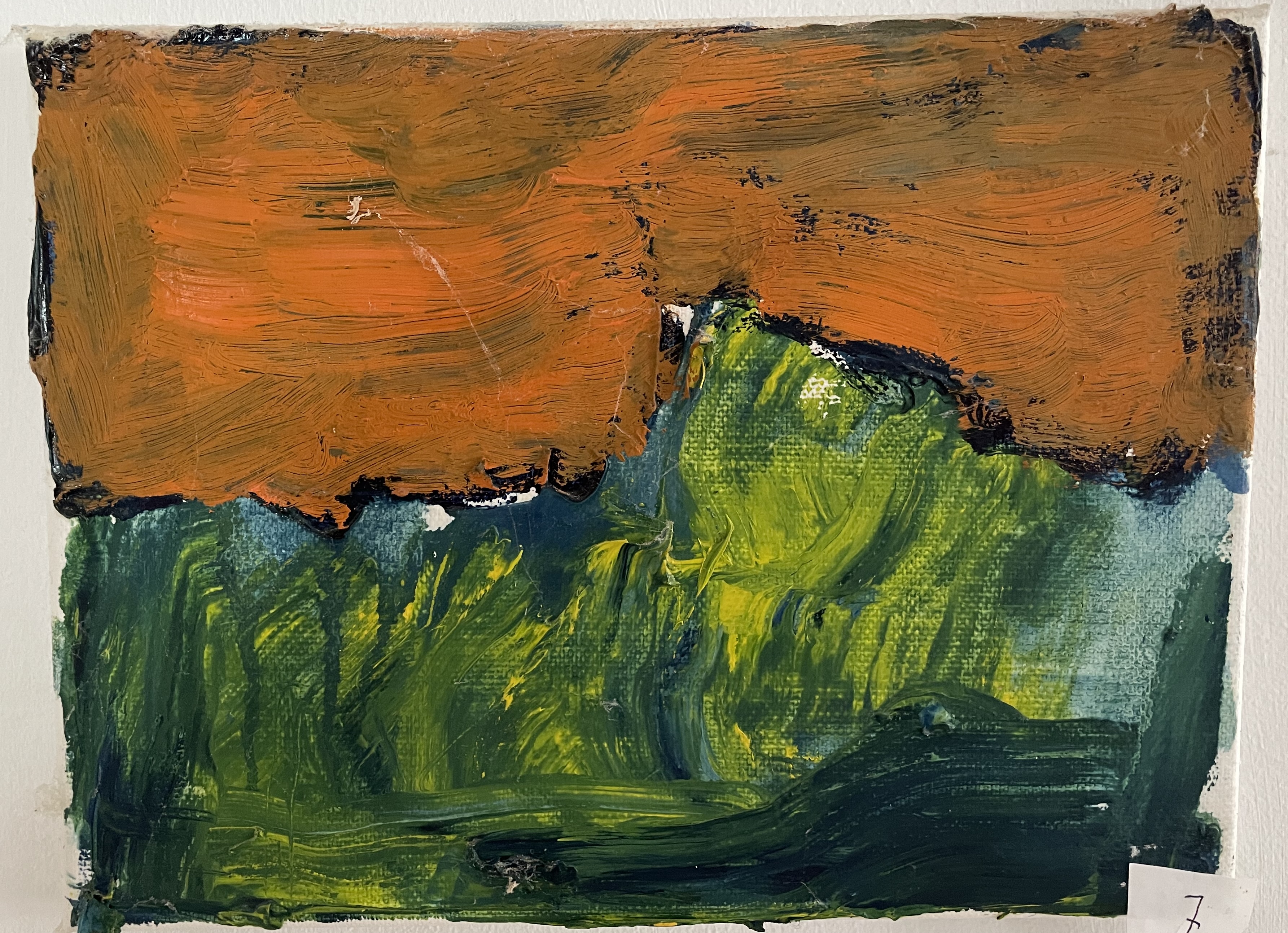
A small painting in landscape format, divided into two zones: an upper densely painted orange-rust-red surface and a lower zone in dark green with lighter green and yellow upward strokes. In the centre a green form pushes up into the orange field. White canvas ground visible at the edges.
Formally, the painting is a study of the meeting between two colour masses. The orange field is heavy with horizontal strokes; the green is open and agitated with straw- or flame-like upward marks. The dark contour between them functions as a weld seam. The complementary contrast orange/green makes the surface optically active. A paper tag with the number 7 suggests series numbering.
Interpretively: a minimal landscape — a glowing sky over grass or scrub — but equally readable as a pure colour confrontation where the motif is the boundary and its rupture. Double resonance with Mark Rothko's colour fields and with Oluf Høst's expressive landscape reduction.
What is interesting: The painting's scale ambiguity — without known dimensions, it could be a monumental colour-field painting or a palm-sized sketch.
Small landscape format with two main zones. Upper: a broad orange-brown field with visible curved brush marks and dark passages. Lower: green, blue-green and yellow-green field with a lighter rounded green form rising slightly right of centre. The boundary is uneven with dark paint or visible light ground.
A strongly compressed composition. The broad warm surface above lies like a heavy ceiling over the cooler, more varied lower part. The paint is thick enough that the canvas texture and the brush's movement are an active part. The orange field relatively unified; the green areas with multiple directions. Post-painterly abstraction, Fauvist landscape painting, colour field — but with marked materiality.
Surprising: That the modest format evokes an almost monumental sense of space. The two broad fields can be experienced as enormous geological or atmospheric zones — yet the surface retains the closeness of hand and brush.
Portrait format with roughly hewn horizontal colour fields. Upper, broadest zone: orange/ochre with broad horizontal brushstrokes. Lower zone: blue-green and green with more open, upward strokes. The boundary: unclear and frayed. A slightly rounded, lighter green form rises from the lower field and penetrates into the orange, just to the right of centre.
In its simplicity, the painting investigates shifts in spatial dominance and the mutual 'struggle' of colours. Orange is aggressive against the cooler green. Complementary contrast. The green form's 'uprising' in the orange resembles a resistance movement. Undecided: is orange sky and green earth, or vice versa? Nicolas de Staël, Rothko.
Surprising: The precise placement of the green form — not in the centre but slightly to the side, almost as if evading a direct confrontation with the orange dominance.
Response not yet available.
Night Sea
Night Sea
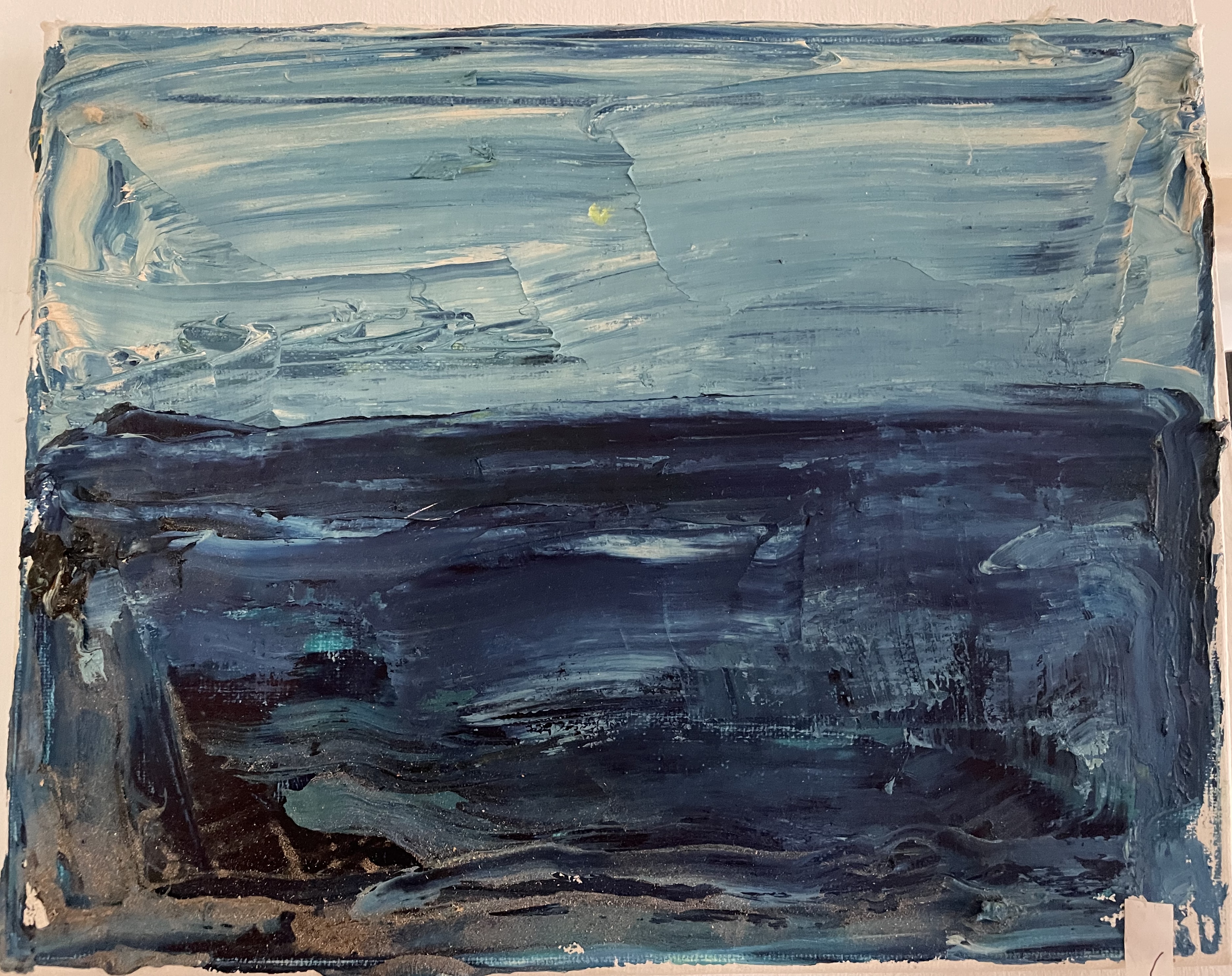
A smaller painting in landscape format with a marine-like two-part division: above a light, ice-blue zone; below a dark, almost blue-black zone with agitated strokes. In the light zone a single small yellow dot. A gritty, sandy passage is embedded in the paint mass. No signature visible.
Formally: the classic horizon division, but without gradients — light over dark, each zone with its own stroke direction. The yellow dot is the composition's only punctual element and carries disproportionate weight. Most striking: the embedded sand makes the shore a physical reality rather than a depiction — the painting contains its motif's material.
Interpretively: a nocturne over the sea, the yellow dot a fixed point of longing — the only thing the eye can hold on to. The presence of sand pulls toward the site-specific. Resonances with Emil Nolde and material painting after 1950 (Dubuffet, Tàpies).
The ambiguity: The yellow dot — deliberate or accidental? The entire mood of the painting depends on the answer.
The painting is horizontal, divided into a light blue-grey field at the top and a darker blue-black field below. The division at roughly mid-composition suggests a horizon, but thick, uneven and broken. In the light part: broad horizontal strokes, scraped marks and a small yellow-green dot near the upper centre. The dark part: blue, violet, grey and black movements plus a dark brownish area on the left.
The dark lower zone more dense and varied than the upper — heavier and closer. The horizon not a thin line but a massive band that almost closes the connection. The small yellow-green marking modest in colour but visible against the limited palette. The radically simplified sea motif connects to colour field painting, yet the rough surface pulls toward a more material expressive tradition.
Most ambiguous: The small yellow marking. Almost ignorable — but once seen, it organises the entire picture as a space with distance and scale.
Horizontal, divided into a light blue/white upper half and a dark blue-black lower half. A clear horizontal dividing line almost edge to edge as a definitive horizon. Upper: long, calm strokes with a wide brush. Small yellow-green dot centrally. Lower: short, turbulent strokes in blue, violet and black tones.
The horizon line is slightly skewed and breaks on the left — a comment on the landscape's instability? The small yellow dot interrupts the monochrome calm: moon, sun, distant ship — emphasising proportions and enormous infinity. Gustave Courbet's seascapes, Rothko, Allan Otte and older Danish colourist tradition.
Contradiction in materiality: We are presented with water and air (fluid, weightless elements), but they are conveyed through heavily material impasto — paint-lumps that shout of physical resistance against the nature of the elements depicted.
Response not yet available.
Hooks and Energy
Hooks and Energy
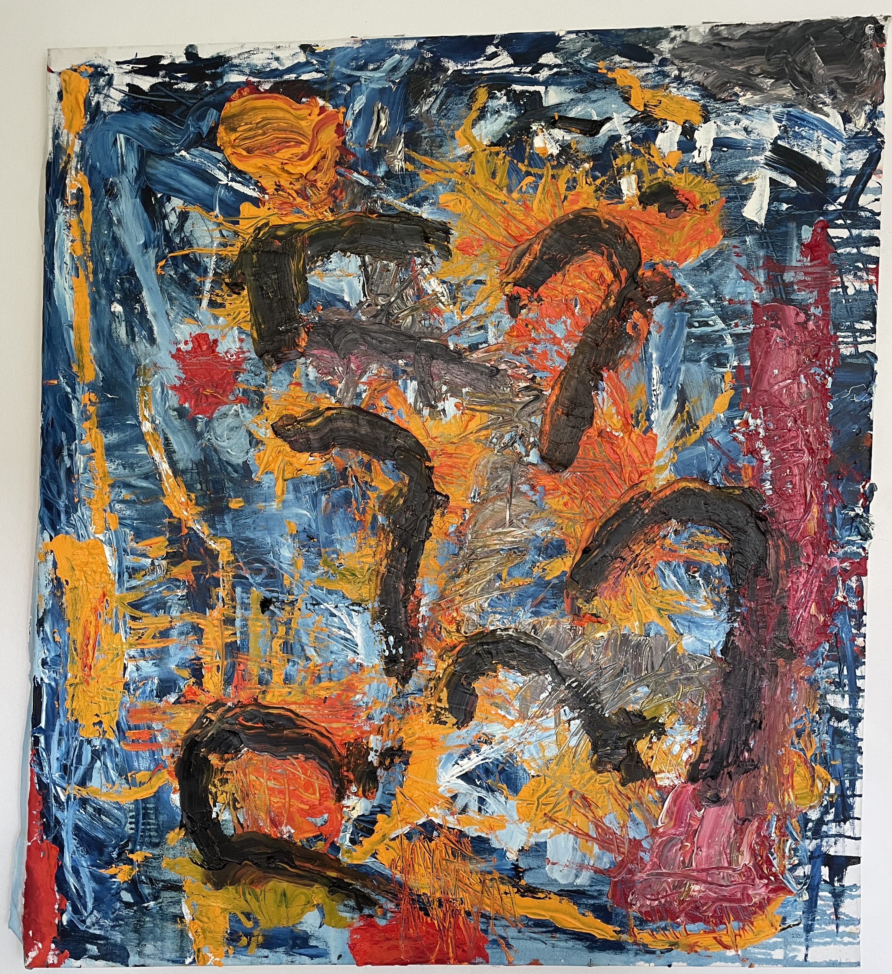
A large abstract painting in portrait format with violent impasto. Over a blue, gestural ground with white and black inclusions lies a central area of saturated orange and yellow, in which fat, dark-brown hook- and arc-shaped strokes are dragged with very thick paint. On the right a vertical red-violet zone. The surface relief is so high that the paint ridges cast their own shadows.
Formally: the painting organised as an energy field. The blue ground is painted in criss-crossing, rapid strokes establishing an agitated space; the orange areas lie like explosions and the brown hooks like heavy, slow figures. The hook-shaped marks repeat at varying angles, creating an almost calligraphic rhythm. CoBrA gesture: Appel, Jorn.
Interpretively: the brown hooks as bodies, tools or letter-like signs in a private alphabet — the painting as incantation. The energy ambivalent: fireworks or conflagration.
Surprising: How similar the brown marks are. Amid the apparently uncontrolled, an almost disciplined repetition emerges.
The painting has a portrait format and a very dense pictorial field. Background: blue, light blue, white, orange, red and grey strokes crossing each other. On top: several thick dark brown or black curved forms — hooks, horseshoes, arms, pipes or crude signs. A tall magenta-red form along the right side. Orange areas gathered around the centre.
The composition is almost all-over; the dark arcs create a clear rhythm from top to bottom. Their thick outlines contrast with the fragmented movements of the background. The action painting tradition: the stroke registers movements over time. CoBrA and the direct, bodily line of graffiti.
Contradictory: The dark forms simultaneously create and disturb order. Without them the painting would be an explosive colour field; with them rhythm and possible figures emerge. But precisely because they make the painting more readable, they also make it more enigmatic.
Portrait format. Base layer: blue, yellow and orange colours that are gaudy and restless. On top: heavy black paint strokes shaped as hooks, worms or contorted semi-circles. Far right: a vertical magenta/reddish field. Violent, teeming dynamism. Composition near all-over.
The black arcs function as striking, graphic stoppers that bind the surface. Primary colours versus thick, matte black give a pulsating spatiality. Violent speed in the brushwork. Organic putrefaction, biology through a microscope, or pure psychic energy discharge. The black figures as bacteria or primitive life-forms consuming the colour layer below.
Surprising: The red vertical field on the right side suddenly hits the brake and acts as a structural, almost door-like blockage in an otherwise entirely amorphous floating whole.
Response not yet available.
Red Runs · 2025
Red Runs
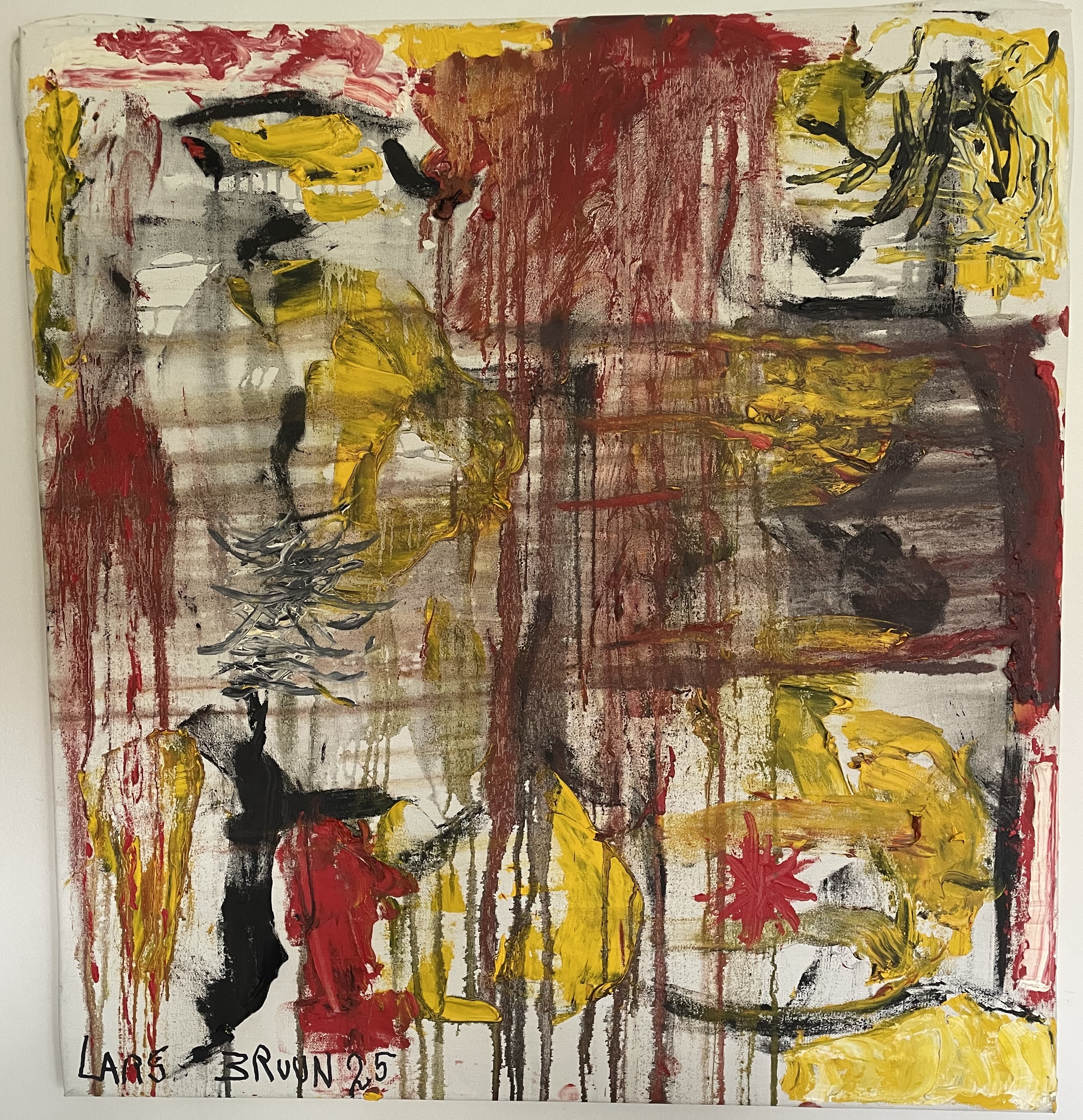
A nearly square painting on a light, only partly covered ground. Pigment concentrated in yellow, deep red/brown-red and black with small areas of pink and grey. Characteristic: long, vertical runs of thin red and grey paint beside fat, impasto yellow blobs and black angular strokes. Left of centre a cluster of short, silver-grey needle-like strokes. Signed 'LARS BRUUN 25'.
Formally, the painting plays on the meeting between the fluid and the fixed: the runs are gravity's handwriting, while the yellow and black areas are the hand's decisions. The white ground works actively as light and pause. The colour triad yellow-red-black holds the surface together across its scatter.
Interpretively: a bodily, almost vulnerable undertone — the red runs are hard to see without associations to blood or fluid. Can also be read as a wall with traces — poster remnants, overpainting. Resonances with informal and action painting, Twombly, Jorn's lighter late works.
The ambiguity: A mood oscillation between liveliness and unease — the palette warm and vivid, but the runs pull toward decay.
The painting is dominated by vertical flows. Red, brown, yellow and black paint apparently applied wet and allowed to run downward (drips). In the centre and left, figures emerge: a whitish field suggests a skull or mask with closed eyes and a rib-like body below. On the right, more diffuse yellow areas and a distinct red star/cross at the bottom.
The composition dominated by vertical lines via thinner paint. The space is flat and functions as a wall paint is running on, but depth via layers of white and yellow paint over dark background. The smearing of lines plus sharp red and black palette gives a graphic, bloody expression. Francis Bacon's dissolved portraits, Jean-Michel Basquiat's skulls and direct symbol language.
The contradiction: The yellow colour — surprisingly warm and encouraging in a painting that otherwise structurally appears dripping-macabre.
The painting is dominated by vertical flows — red, brown, yellow and black applied wet and allowed to run downward. In the centre and left, figures are suggested: a whitish area as skull or mask with closed eyes. On the right, more diffuse yellow areas and a red star/cross at the bottom. Signature 'LARS BRUUN 25'.
Vertical lines via thinner paint. The space is flat like a wall that is running, but depth via layers. The smearing of lines combined with sharp red and black palette: a graphic, bloody expression. The affinities are Francis Bacon's dissolved portraits, Basquiat's skulls and direct symbol language.
Contradiction: The yellow colour surprisingly warm and encouraging in a painting that otherwise structurally appears dripping-macabre.
Response not yet available.
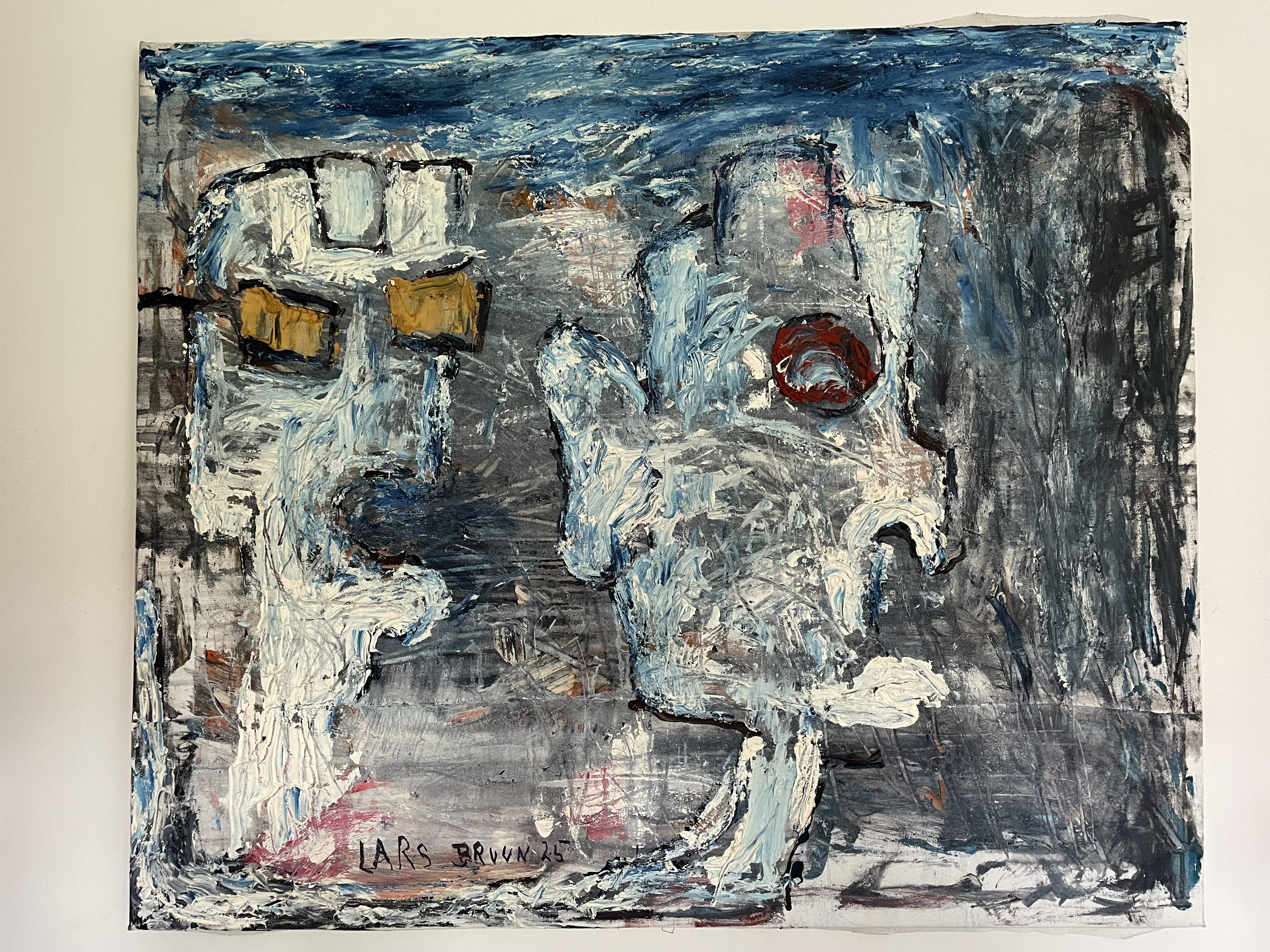
Two Beings · 2025
Two Beings
A painting in landscape format in a cool palette of blue, grey, white and black with few accents: two yellowish angular areas on the left and a red-brown circle form in the right half. Over the grey-blue, scratched ground two large, whitish-painted figures with thick, curving paint — animal or creature-like shapes in profile. At the top a dark blue zone as sky or frame. Signed 'LARS BRUUN 25'.
Formally, the painting builds on figure-ground contrast: the ground is scraped and agitated, the figures painted on top with fat, creamy white that almost stands in relief. The red circle as counterweight and eye-catcher — an 'eye' in the composition. The colour mood is wintry. The CoBrA tradition, Dubuffet's art brut, Per Kirkeby's layer-on-layer surfaces.
Interpretively: a meeting between two beings — two animals, two people, or one being and its mirror. The red circle as sun, eye or mark, letting the scene tip between everyday and mythic.
The ambiguity: Do the figures face toward or away from each other? Is the scene a meeting, confrontation or accidental coexistence?
The image clearly shows two figures, painted in white, thick, crackled and crude strokes that stand out against a dark blue-grey background. The figure on the left is high-headed, more angular and bears two prominent yellow square 'eyes' or glasses. The figure on the right is more knotted with one dominant round red eye. The background structured by horizontal and vertical brushstrokes.
The figuration here is unambiguous. Strong contrast: the glowing white, almost inorganic figures against the dark ground. The paint applied extremely aggressively with an almost trowelled character. The geometric (yellow squares) vs the round (red circle) biology. Art Brut, Dubuffet, street art, Basquiat.
Most ambiguous: The interplay between the two figures — are they looking at the viewer, or at each other? What do the small pink/red specks mean?
The image is horizontal and dominated by grey, light blue, white, dark blue and black with individual red, pink and ochre details. Several large, light, thickly painted forms occupy the foreground. On the left a form can suggest a standing or sitting figure; a larger form in the centre and right can resemble an animal, a machine or a hunched figure. A red circular element in the upper right part of the middle field. Along the right edge a dark vertical mass.
The composition organised around a central space between the light forms. Strong white and blue-white contours create figures but are uneven, dissolved and partly merged with the grey background. The paint very thick — almost sculptural presence. Art Brut, Jean Dubuffet; the figure pushed forward by thick layers and broken contours. Recognition depends not on anatomical precision but on relations between masses, openings and individual marks.
Most ambiguous: The painting appears strongly figurative without giving secure access to any figure. One feels a situation unfolding, but cannot determine who or what is participating.
Response not yet available.
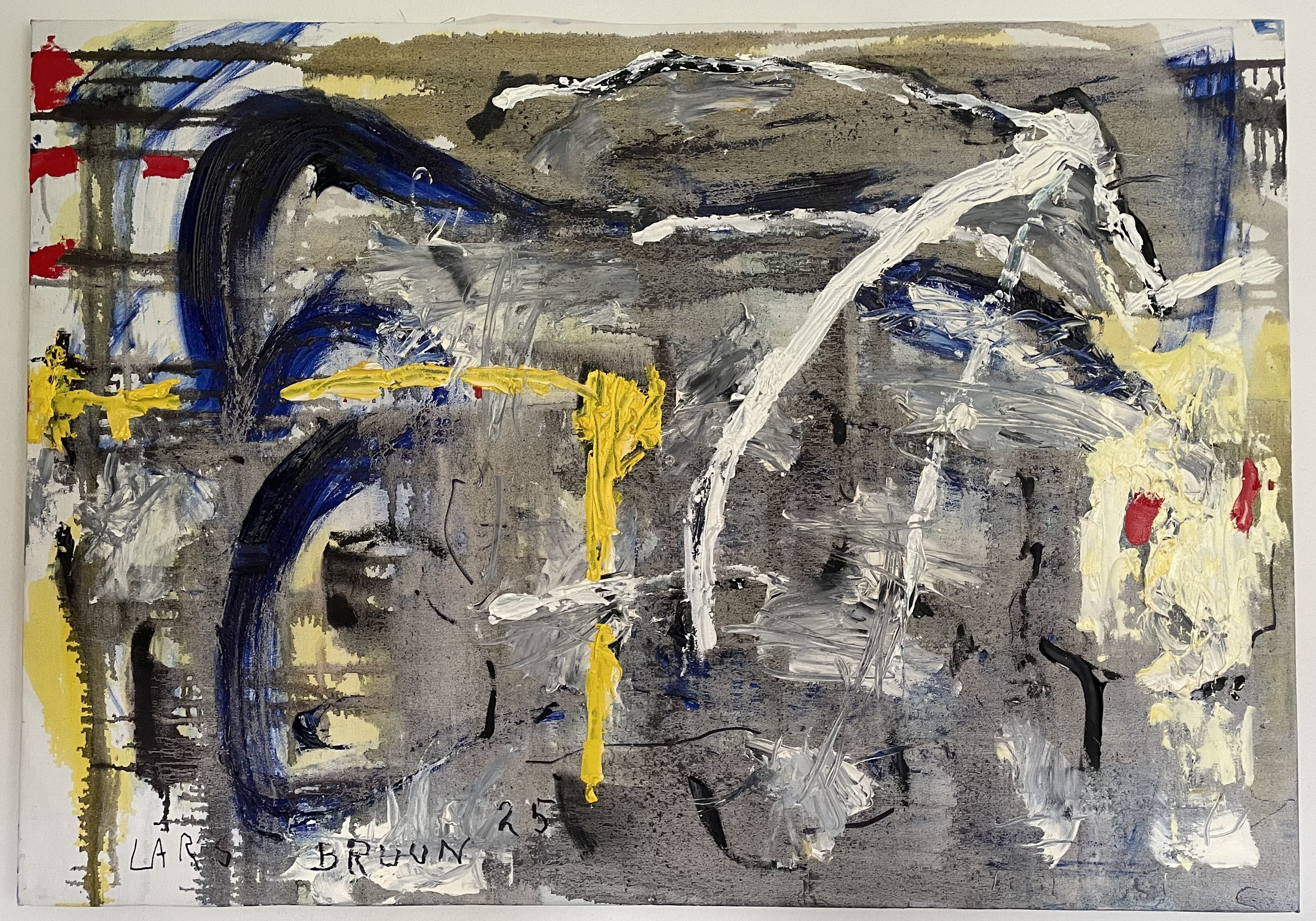
Arcs and Movement · 2025
Arcs and Movement
A painting in landscape format on a grey-brown, mottled ground that in places resembles untreated canvas. Over it run large dark-blue arcs in the left half, a white impasto stroke-movement moving diagonally through the right half, and a broken yellow impasto figure around the centre. On the left edge: vertical yellow and black accents with red dots; on the right: a pale yellow area with red marks. The signature 'LARS BRUUN 25' is written large along the bottom edge.
Formally, the painting is more airy than dense: the ground is allowed to stand as space and tone. The painted elements appear as few, large gestures. The composition can be read as choreography: the white movement drifts in from the right; the yellow figure brakes it. Lyrical abstraction, Cy Twombly, Kirkeby and Tàpies' material-consciousness.
Interpretively: a movement painting — not a motif but a process. The large signature almost functions as a pictorial element.
Surprising: The emptiness. Compared to the most densely painted works, this one dares to leave large zones almost untouched.
The painting has a cool colour scale of grey, black, white and blue with isolated strong yellow and red passages. A broad dark-blue to black arc moves from the upper left downward. A large white curved line runs from the upper centre toward the right and down. Yellow near-horizontal forms cross the grey ground; small red areas near the left and right edges.
The painting combines a scraped, uneven ground with few very dominant linear movements. The dark arc on the left and the white arc on the right establish two large, opposing trajectories that almost meet in the centre. The yellow marks function as cross-connections or stop-blocks. A diagrammatic character without becoming precise.
Surprising: That the large white arc can be experienced as both a physical construction and a completely free brushstroke. A diagram that explains nothing but makes movement and connection palpable.
Horizontal format with predominantly grey, black, white and blue palette broken by prominent blue arcs on the left and light yellow formations and lines centrally and to the right. Strong vertical and horizontal cross-fields in black over blue upper left. A large white curved line stretches from the top down to the right. A suggestion of a face or figure in white/yellow can be glimpsed lower right with red spots.
The composition is unbalanced: pulled toward the left via heavy dark-blue arcs and black grid-work, while the right side dissolves in light colours and smearing. A distinct progression of lines — the white curve and yellow strokes draw attention around. Per Kirkeby's pop-art architectural surfaces and grid structures combined with raw German Neo-expressionism (Anselm Kiefer).
The contradiction: The yellow/light right side, where two red spots powerfully draw the eye. Amid architectural grey/blue chaos something peeks out that insists on being seen as an animal or skull with blood-red eyes.
Response not yet available.
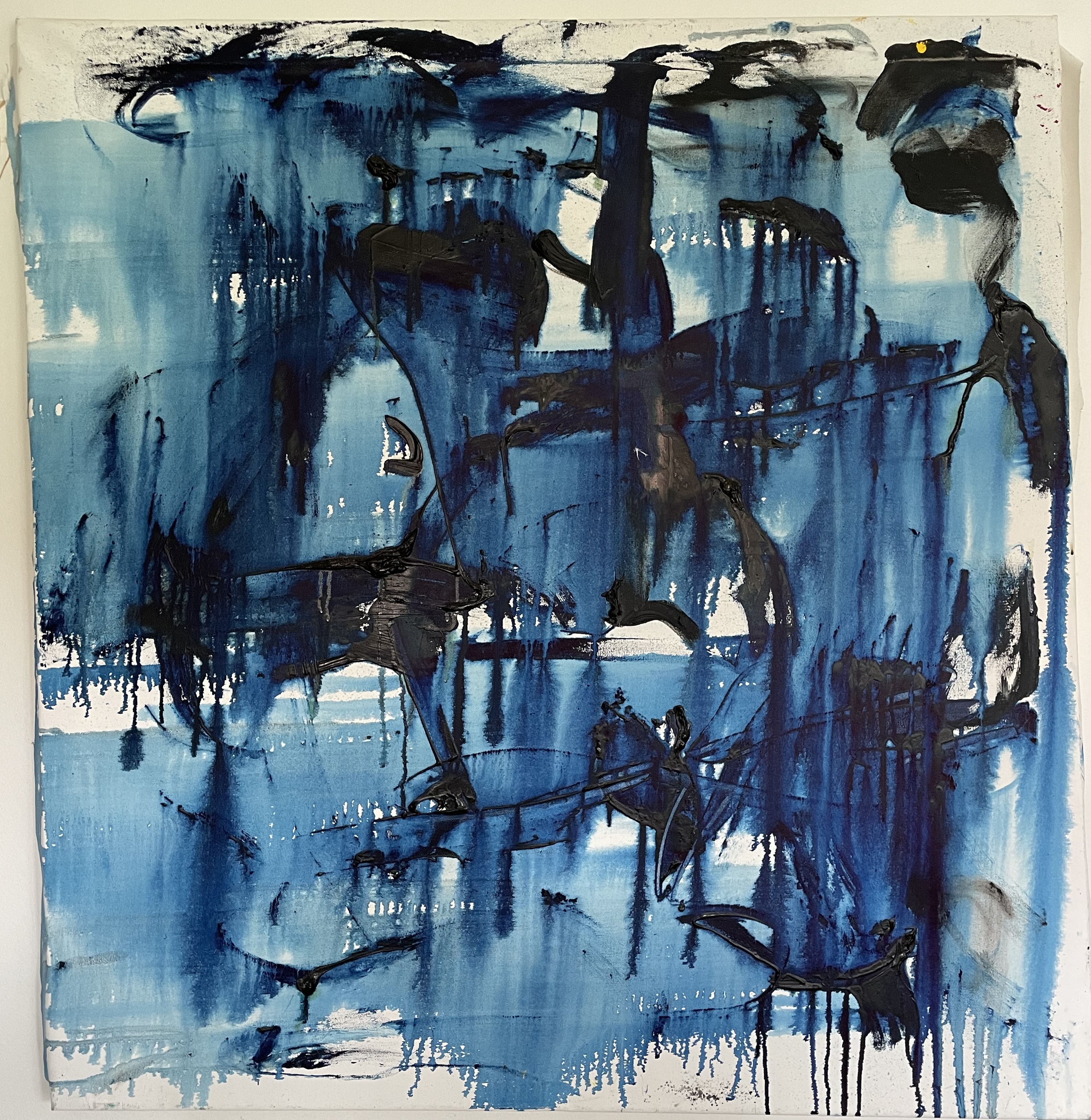
Blue Rain
Blue Rain
A nearly square painting dominated by blue on white ground. Thin, flowing blue paint has been drawn in broad bands and allowed to run in long vertical drips; over this darker, almost black blue areas in fatter paint plus individual thinner drawn lines. In the upper right corner a small yellow dot as the only foreign colour. No signature visible.
Formally, the painting is a 'wet painting': the primary device is the thinned paint's own behaviour — flow, pooling, runs. The composition gathers weight in an upper, dark zone, from which the painting 'rains' downward; white reserves keep the surface breathing. Informal painting, Pollock's drip (turned vertical), processual tradition.
Interpretively: water metaphors — rain, cascade, waterfall, or a rain-wet window. The mood melancolically downward.
The ambiguity: The relationship between control and release — the runs are wilful, but their distribution seems considered. The small yellow dot, precisely placed in the corner, suggests: more control than you'd think.
The painting is dominated by strong blue and turquoise tones with dark blue, black and individual brownish-grey forms. Paint has run vertically in several places, and light areas of the ground stand open. Across the surface a network of dark calligraphic strokes: some form hooks, wings or boat-like silhouettes, others suggest vertical columns, bridges or hanging constructions. The upper edge relatively dark and dense, the lower part more open.
The blue ground appears fluid and transparent while the dark forms are more compact and defined. The drips give a continuous vertical direction, crossed by dark horizontal and diagonal lines. The painting as flooded city, harbour, night sky or space filled with flying and swimming creatures. Calligraphic abstraction, East Asian ink painting.
Most ambiguous: That the blue surface both opens and dissolves the space — a large, light-filled environment, but the drips recall paint on a vertical surface.
Response not yet available.
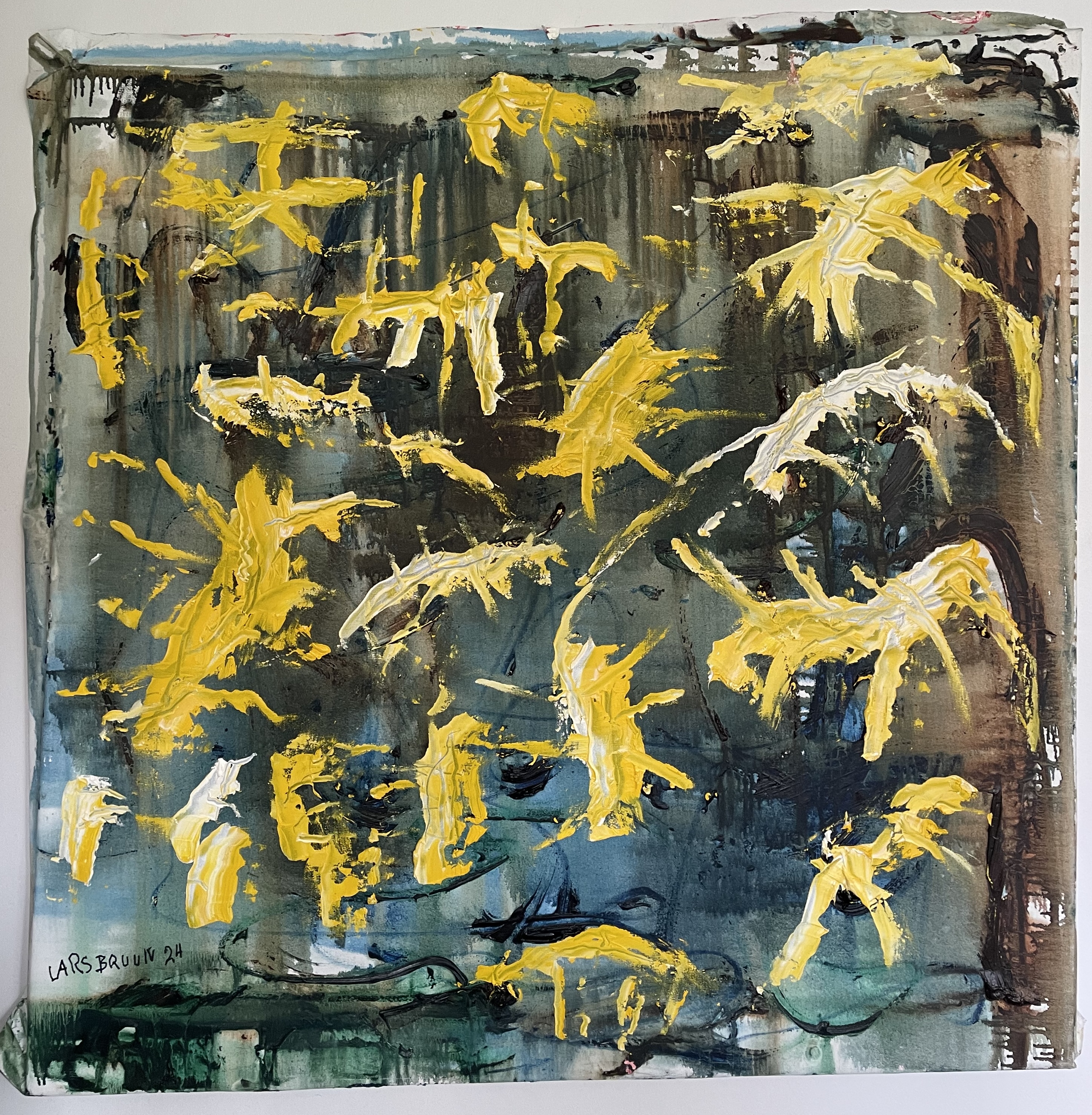
Yellow Birds · 2024
Yellow Birds
A nearly square painting in which a large number of yellow and off-white, star- or bird-like brush figures are scattered over a muted ground in grey-blue, green and brown. The ground is painted thinly and fluidly with visible runs; on the right side a vertical brown zone. The yellow figures are painted with thick, fat paint in short, radiating strokes from a centre. Signed 'LARS BRUUN 24'.
Formally: the painting organised as a scatter-field — the repeated motif varies in size, density and direction across the surface without a centre. The rhythm is the painting's true composition. Late Monet (water-lilies), CoBrA's mark-like nature figures, Cy Twombly's late flowering paintings.
Interpretively: forsythia, broom, rapeseed — or a flock of glowing birds. Striking lightness and joy compared to the darker works; the painting as a celebration.
Surprising: How close the painting comes to the decorative without becoming it — the runs and the ground's murky dark keep the sweetness in check.
The painting has a nearly square, portrait-oriented format. The ground field: blue-green, grey, brown and black layers with vertical runs. Over this field: many yellow and a few off-white, pointed forms — birds, leaves, flames, insects or star-like marks. Forms vary in size and direction and are painted with clear, thick strokes. Along the right edge a dark brownish vertical zone.
The repeated yellow forms create an all-over rhythm, but not mechanically identical. The strong yellow colour steps forward against the cool, dark background, making the motifs appear as a layer in front of the space. The counterpart: the vertical drips in the ground field give weight and direction, while the yellow figures counteract gravity. Matisse (distant resonance), CoBrA, Twombly.
Contradictory: The painting seems both lively and burdened. The yellow forms can be experienced as flying, dancing or sprouting — but the dark background and descending runs give a heavy, almost polluted atmosphere.
Response not yet available.
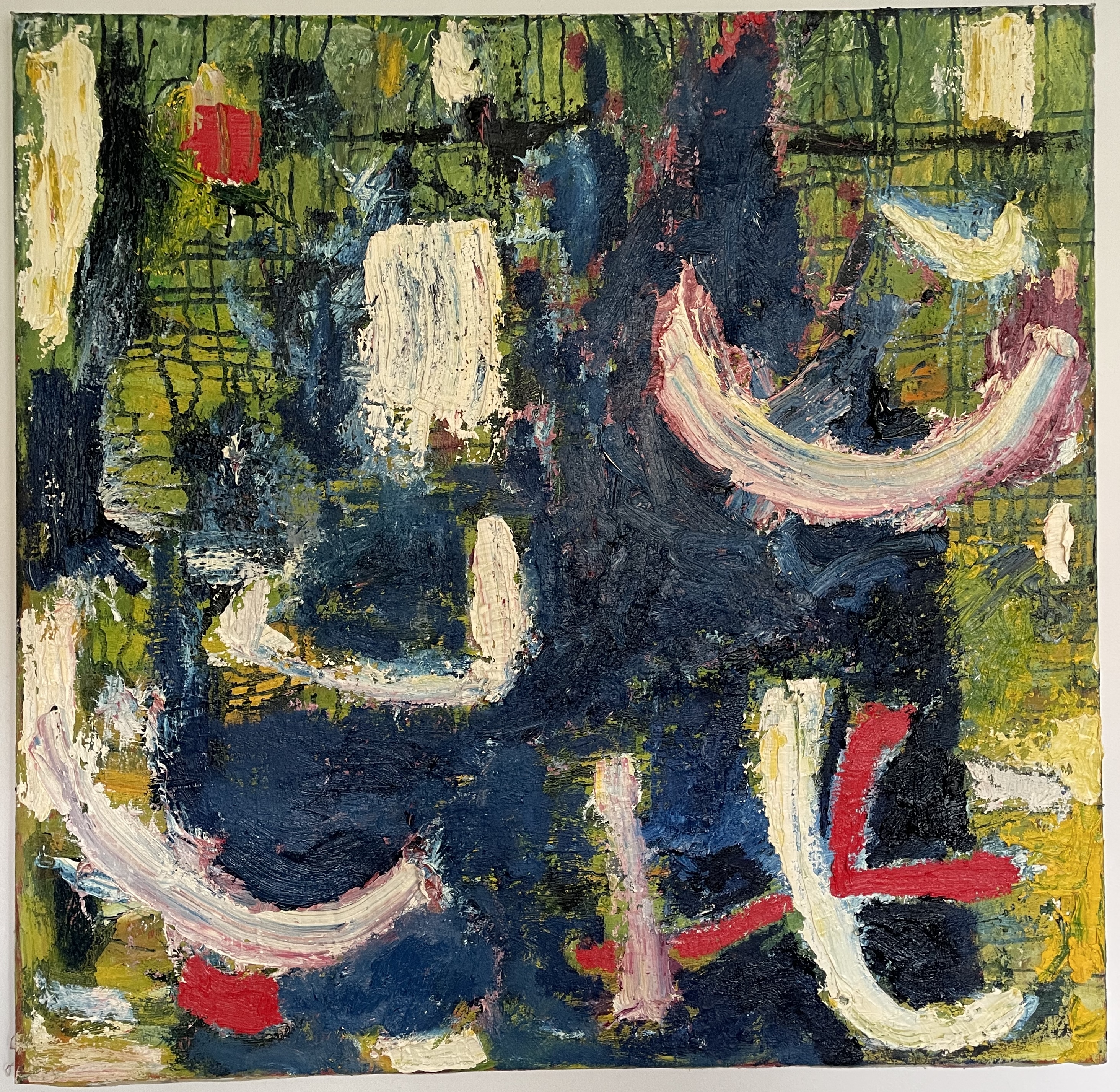
Dark Grid
Dark Grid
A nearly square painting with a heavy, dark-blue colour mass spreading from the upper centre downward, surrounded by a ground in grass green, olive and yellow with a scratched, grid-like pattern. Over the blue: curved strokes in white, pink and pale blue — two large arc forms — and angular red accents plus a red rectangle upper left. The paint consistently very thick, dry and grainy.
Formally: densely packed impasto work where materiality carries more than drawing. The light arcs mirror each other across the centre, creating a slow rotation in the surface. The green grid-work at the edges functions as a breathing frame. The colour contrast is dissonant rather than harmonic. Late Asger Jorn, Eugène Leroy's extremely impasto painting, Frank Auerbach's kneaded surfaces.
Interpretively: a garden or scrub at night, the blue being darkness as mass, the arcs being movements or creatures.
The ambiguity: The painting's tempo — the rapid arcs on top and the heavy, slowly accumulated mass below tell two different stories about its making.
The image has a nearly square format and a green, yellow-green and dark-blue ground. A fine black grid or net is visible. Over the ground: large dark-blue masses, pale cream-coloured rectangles, pink-white arcs and individual strongly red forms. Lower right: a clear white and red angle- or letter-like mark. Two broad, pale pink arcs, one upper right and one lower left.
The composition sets an organising grid against free, thick movements. The dark-blue areas gather in the centre, giving a heavy core. The two large arcs create diagonal relation across the composition and rhythmic repetition. Paul Klee and Joan Miró — symbols standing between writing, figure and landscape. CoBrA's spontaneous figures. Double character of system and improvisation.
Contradictory: The painting immediately seems playful, but has a dark, compact centre. The play occurs not on an empty surface but in a field full of resistance and hidden layers.
Response not yet available.
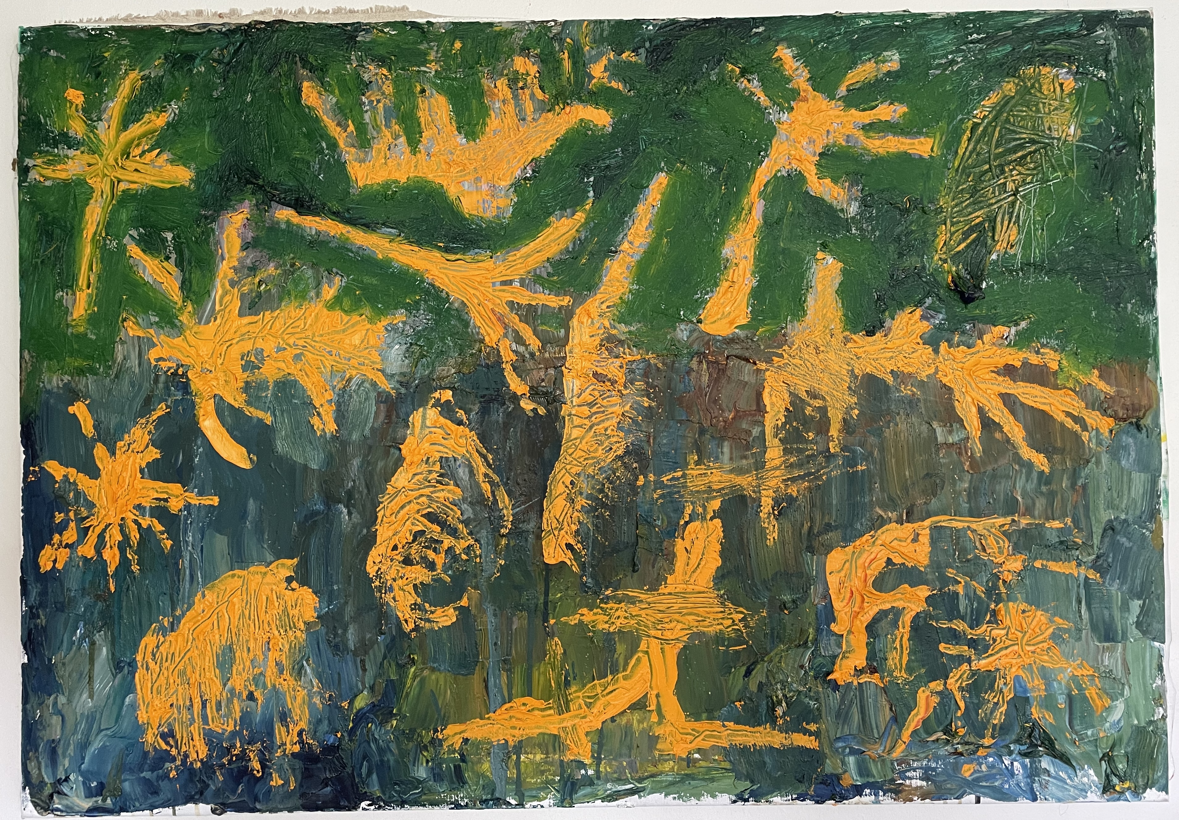
Orange Tree and Creatures
Orange Tree and Creatures
A painting in landscape format with a dark base: the upper part saturated grass-green, lower and middle areas in deep blue-green and brownish tones. Over the entire surface figures are painted in strong orange impasto: star- or sun-forms at the top, a large branching form in the centre — a tree — and compact figures readable as animals or humans. In the upper right corner a scratched leaf-like pattern.
Formally: two-layer structure — a dark, wetly painted forest- or night-base and a light, drawing-like layer on top in single-colour orange. The figures are signs rather than depictions. The complementary play green/orange makes the figures self-luminous. Rock-carving picture-writing, CoBrA (Jorn, Constant), Joan Miró's scattered sign-pictures.
Interpretively: a narrative or a cosmological map — stars above a tree, creatures around it.
Surprising: The narrative character amid otherwise abstract material. Is this conscious mythology or patterns the hand found in the process?
The painting has a wide format with dark green and blue-green ground divided into larger blocky fields. Over the ground: many orange-yellow, linear forms. They are pointed, branching and often animal- or plant-like. Some can resemble birds, fish, insects, skeletons, leaves or stars. A brownish-grey horizontal zone runs through the centre; upper right an elongated leaf- or shield-like form with scratched pattern.
The orange forms are executed as thick, relief-like lines that bind the painting via a shared colour. They vary strongly in size, direction and density — the repetition rhythmic rather than pattern-like. The green ground heavy and layered. The orange/green contrast strong. Cave painting and early pictorial traditions, Paul Klee and CoBrA artists' biomorphic signs.
Surprising: That the forms seem both alive and fossil. They spring forward via colour contrast but their imprint-like character makes them into remains too. The painting holds life, registration and erasure open simultaneously.
Response not yet available.
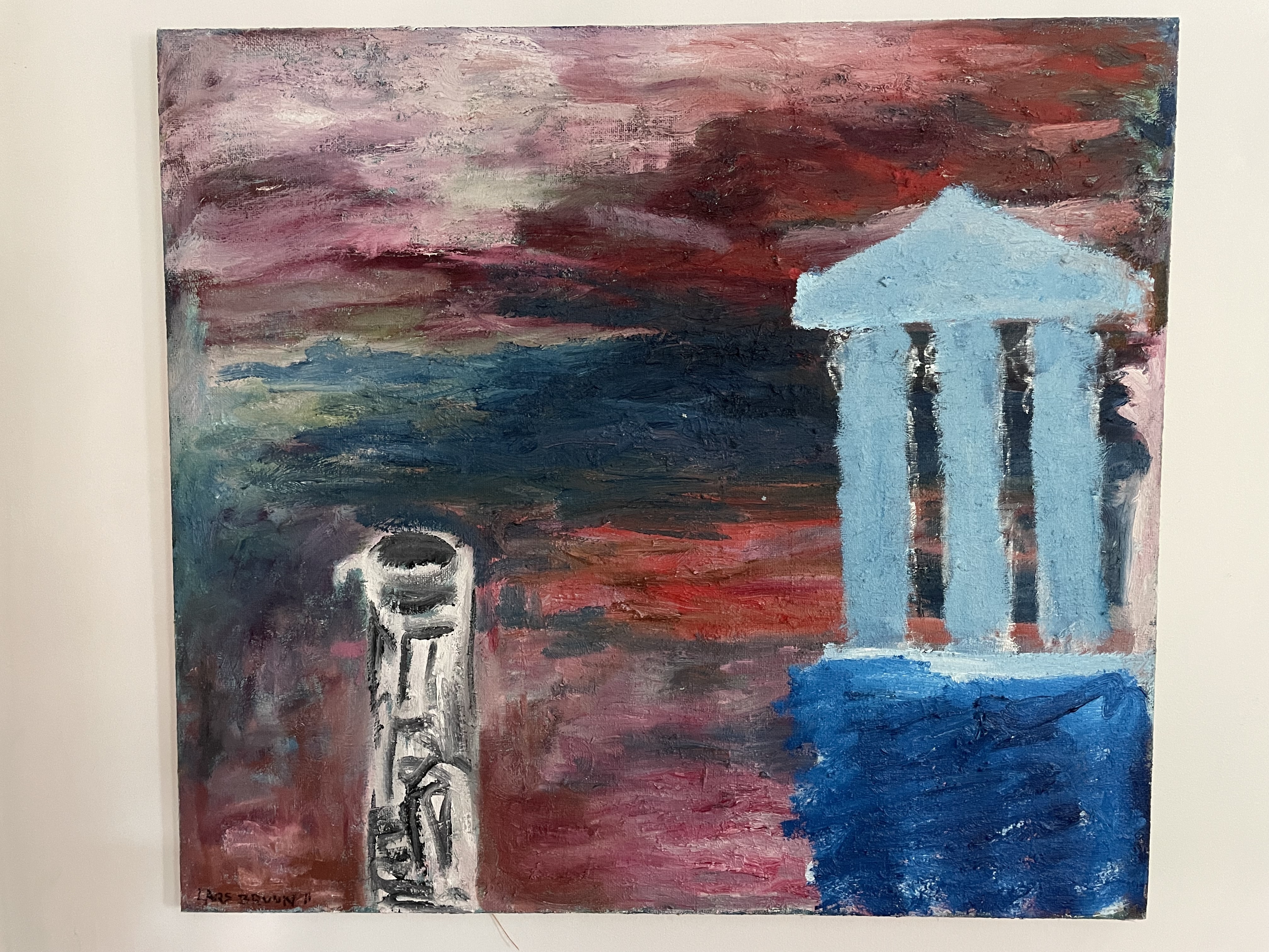
Temple and Column
Temple and Column
A painting in landscape format with two recognisable building motifs in an otherwise dissolved colour space: on the left a greyish-white column- or tower-like form with dark markings; on the right a pale blue temple-like building with a gable triangle and four columns, standing on a saturated blue plinth or water surface. The background is painted in horizontal layers of pink, red-violet, dark blue and greenish. Signature with illegible year.
Formally: a collage of spaces. The background's horizontal stripes function as an abstract mood-space in which the two architecture forms stand without shared perspective. The temple is painted flat and frontal like a sign. Giorgio de Chirico's metaphysical architectures, CoBrA and art brut's 'unlearned' drawing of recognisable things.
Interpretively: memory and cultural landscape — ancient temple and ruined column placed in a mood-sea. The naive, direct drawing gives the painting a deliberately clumsy poetry.
The ambiguity: The relationship between the two buildings — one ruinous and grey-white, the other intact and sky-blue. Decay against ideal.
The image is horizontal with a broadly painted background in red, pink, bordeaux, dark blue and grey-green. Two clearly delimited, architecture-like forms stand in front of the background. On the left, a narrow grey-white column or tower form. On the right, a larger pale blue building with triangular upper section, three dark vertical openings and a strong blue base. No clear ground line connects the two forms.
The composition strongly asymmetric. The large pale blue form on the right dominates through size, clear contour and colour contrast. The background layered and horizontally agitated but without unambiguous perspective. The architectural forms more frontal and stable than their surroundings — edges still painterly uneven. The large building's classical order can be read as authority, but the near toy-like formation makes the authority fragile. Giorgio de Chirico, metaphysical painting, modernist interest in archetypal signs.
Contradictory: That the two forms feel monumental and vulnerable simultaneously. Order and power, but rough outlines and no ground connection.
Response not yet available.
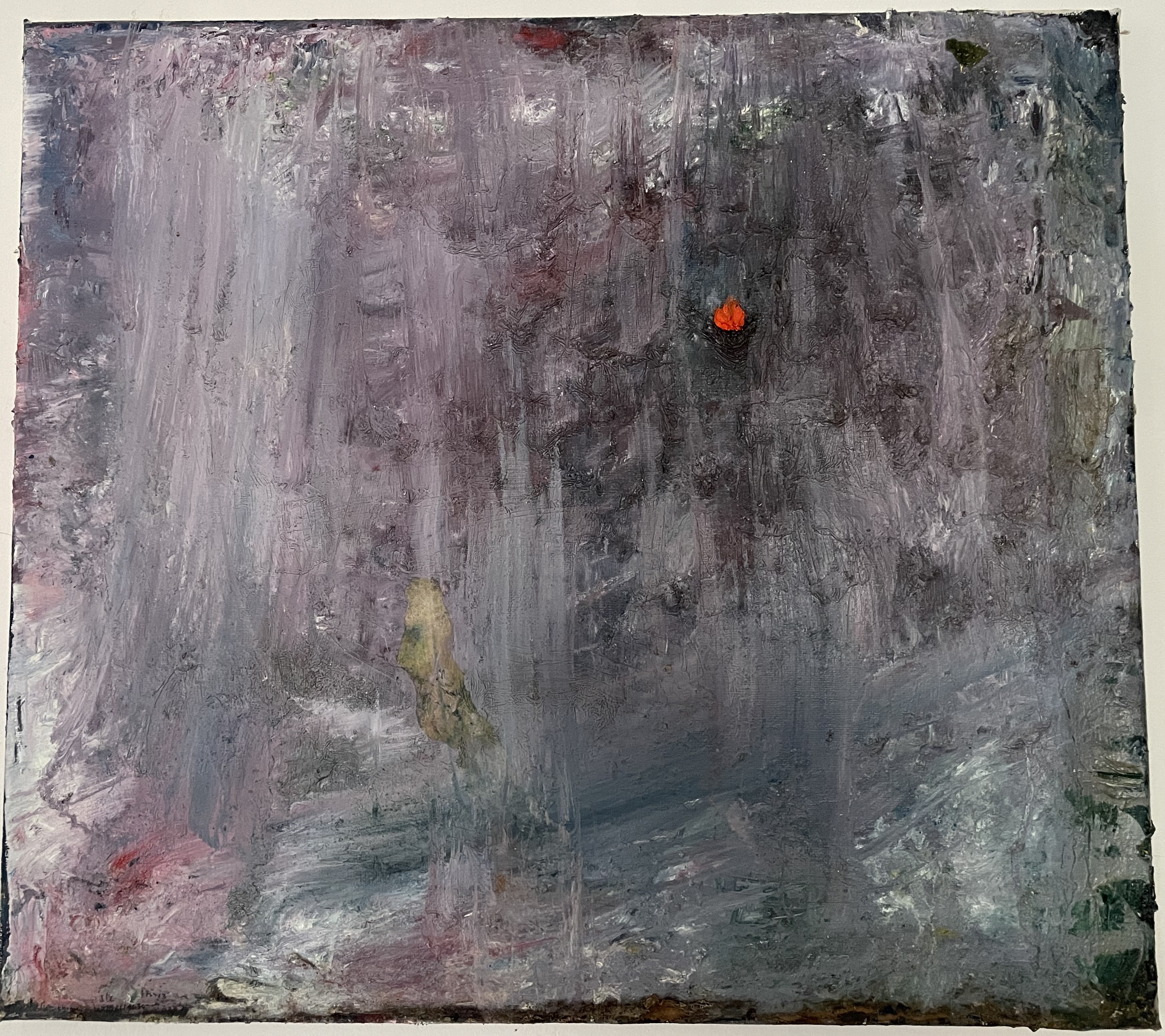
Grey Veil
Grey Veil
A nearly square painting in grey, grey-violet and dusty pink tones, painted in long, vertical, blurring strokes that give the surface the character of rain, mist or a frost-covered window. In the upper right a small, intense orange-red dot as the only saturated colour. Below centre to the left, a yellowish elongated form is suggested — a figure or glint of light. Edges dark and worn.
Formally: the most restrained in its approach — almost without colour contrast, almost without drawing, only direction (vertical), value and materiality. Two weak events hold the surface in tension: the red dot and the yellow figure, placed diagonally opposite each other. Gerhard Richter's grey paintings and photo-blurred works (vertical smearing as a consistent device), Nordic twilight painting.
Interpretively: a painting about seeing poorly — through rain, fog, tears or memory.
The ambiguity: Whether the painting conceals something or shows something. The red dot, small and insistent, prevents the surface from closing entirely around its own silence.
The image is nearly square and dominated by grey, purple, blue-grey and faint pink tones. The entire surface is densely worked with short strokes, vertical smearings and layers close in tone. Near the upper centre, slightly to the right: a small strongly orange-red oval or dot surrounded by a darker ring. Further down and slightly to the left, a narrow irregular ochre-green form. Along edges and bottom, darker and greenish traces can be glimpsed.
The composition rests on a large low-contrast surface and two small deviations. The orange-red dot is the painting's most intense colour and an almost unavoidable focal point. The ochre form functions as a weaker secondary anchor creating a diagonal connection to the red dot. Colour field painting and minimalist abstraction, but with a visibly worked surface. Lyrical or material abstraction. The small red accent in the tradition of the sublime.
Surprising: That such a small red dot can organise the entire painting. Shows how little it takes before a dense near-monochrome surface becomes a space with distance, event and possible narrative.
Response not yet available.